Boost Learning
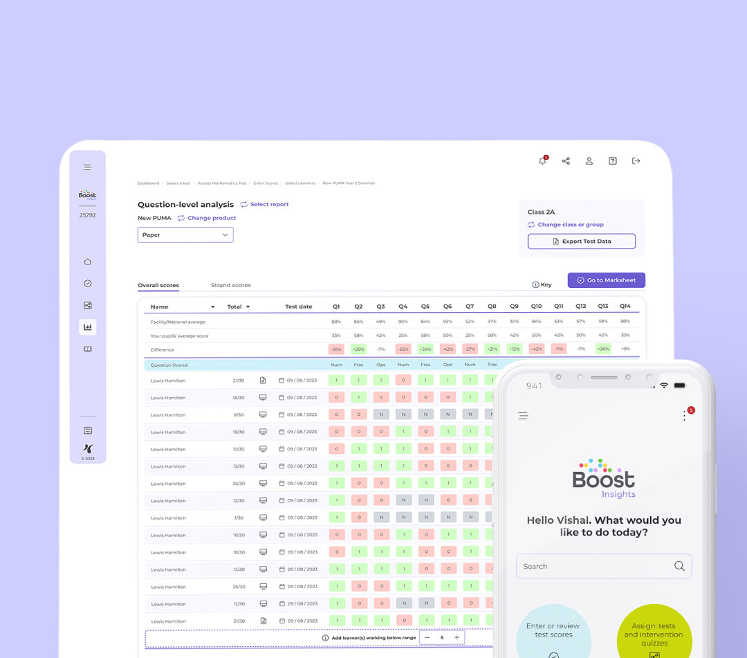
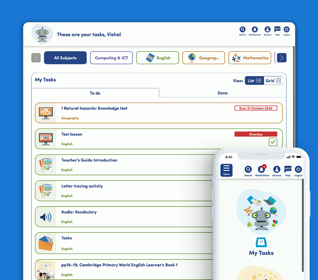
Boost Learning is a digital platform designed for allowing teachers to assign and engage digital content created by Hodder Education to their students. Teachers can assign learning resources and knowledge tests along with tracking their track students scores and progress.
Designer(s): Vishal Mayo
Developer(s): Zeus Learning
The challenge
Before I joined Hodder Education, the company had built the Boost Learning platform during the Covid pandemic to provide a digital platform that allows customers to engage with their products and resources online. Teachers are able to share and assign learning resources to their students and then view scores and details on how they have done and where they can improve. The platform also allows them to create lessons and course plans as well as view ones provided by Hodder within the product to help them strategically plan and organise their lessons over the course of the school year.
Alongside the creation of Boost Primary, the past year Boost has been used by a number of teachers and pupils with more real life feedback being reported about the platform. The need to have a more updated interface in certain areas that were easier to navigate along with a more engaging and useful reporting area were two key points that were promoted to improve. The challenge was to improve the existing interface and create a more consistent and streamlined platform that would help benefit our existing customers and help to entice new and previous customers to use the platform.
The user
The main users I needed to improve the platform for were teachers. The primary focus was to improve the look and feel of the teacher interface and add some new functionality that would help provide a more time-saving and easier interface for them to rely on so that they could spend more time teaching in the classroom than marking and planning their lessons. Another big improvement required was improving the reporting aspect of the interface. Teachers have been struggling with using the reports and understanding what each report on the platform offered and therefore a big focus was required in creating clearer and more structured reports that were beneficial for teachers, headteachers and teaching assistants.
The outcome
With the Boost Learning Platform already being live, the first point of call was to establish design guidelines which had not been previously logged and there were often inconsistencies across which needed resolving. With a focus on the branding I stuck with the use of dark blue and white as the primary colours and then including a lighter blue to complement and act as a secondary colour for hover backgrounds and highlighting where users were selecting or focusing on. These colours all worked together and passed accessibility checks to ensure they contrasted enough to achieve a minimum of a AA rating which was a new requirement for the company to achieve before 2025 when AA will be the required standard. With these changes being made I created a breakdown of component designs to ensure the same components were used consistently across the platform and we had a future style guideline for new additions to the platform (something that was previously not available).
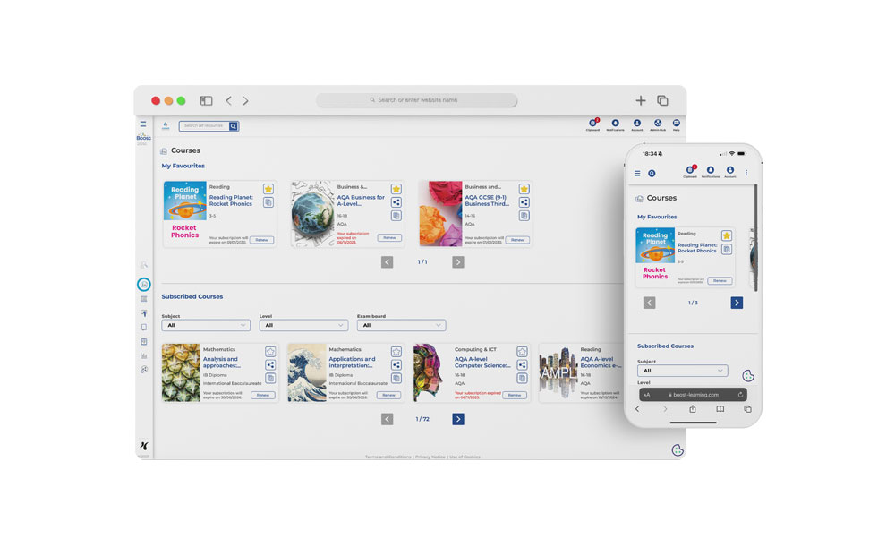
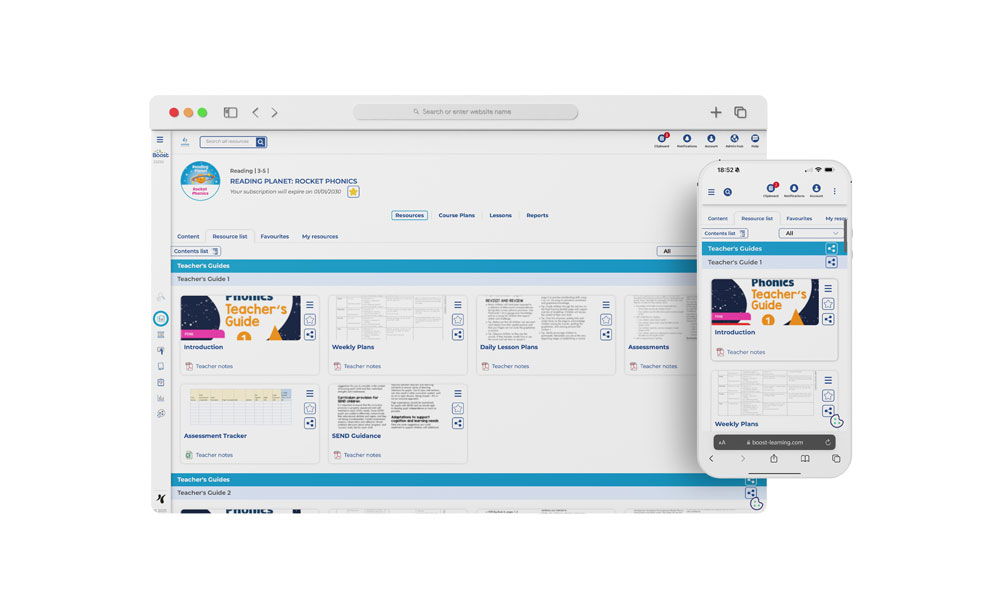
After creating new design guidelines the next focus was to enhance the course pages of the platform. With the Boost Learning Primary platform being created alongside the re-design, there was a need to enhance the platform to ensure primary products worked for new teachers using these courses and to further ensure future-proofing for possible new products that may be added in the upcoming years. One of the key requirements was for teachers to be able to select multiple products within a specific topic or category to share with their students. The need to be able to share a whole topic without having to click each resource individually would help benefit teachers by reducing the amount of time it takes for them to share resources and therefore allowing them to spend their time elsewhere.
With some topics containing a large amount of resources within each one, I looked at the current interface to see how we could subtly include a button to allow the user to select the ability to share all the resources within. Each topic is listed out with a bar above the resources to show a clear separation within the course page. By adding a share button here the button would refer to the topic and that selecting this would share all the resources within. By clicking on the button the user would follow the necessary steps after to select how and who they would like to share the topic with.
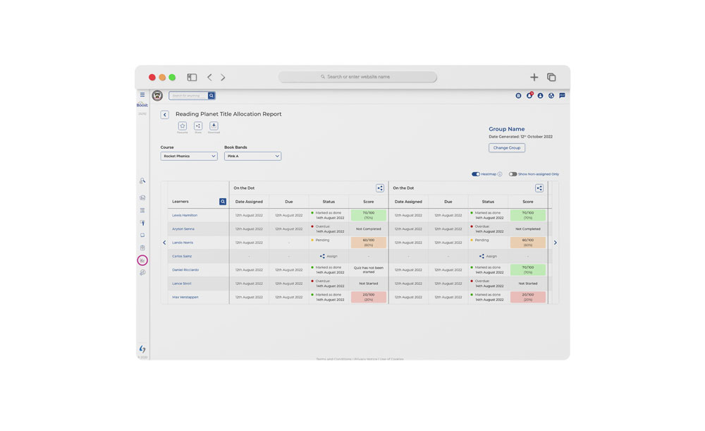
Alongside the launch of Boost Primary, one of the products within Hodder Education is Reading Planet which is a number of educational reading books to help children learn to read all throughout primary school. The books were to be moved digitally to the Boost platform and would allow teachers to use them in the classroom and share with their pupils to read at home. With this is mind, the teachers required a tailored report that would help them view pupils progress and keep track on what students have been assigned and completed.
For this report a lot of key information would need to be displayed to the user in one go. For a whole course users would need to know:
- Bands within the course
- How many books within each band have been assigned
- How many books with each band have been completed
For a specific band within the course, users would need to know:
- Books within each band
- Date book was assigned
- Due date for when book should be completed
- Status of the book (not completed, in progress, overdue or not assigned)
- Score of knowledge test for each book
Due to the large amounts of data to be displayed the best way to lay this out was with two levels allowing for a larger overview of the course and then a filter to further break each band down deeper into the different books within these bands. When evaluating the type of data the only way of displaying this all together would be in a table format. Trying to think of a graph/more visual method would end up looking too confusing and would require educating the user a lot more than required.
The overall course summary would give a breakdown of the different bands within and then how many books have been assigned and completed by each learner that has been selected to view this information on. If the user wishes to see a further breakdown of a specific band they can click on a band in the table or use filters at the top of the report to further drill down where they would see information that was required above for each book.
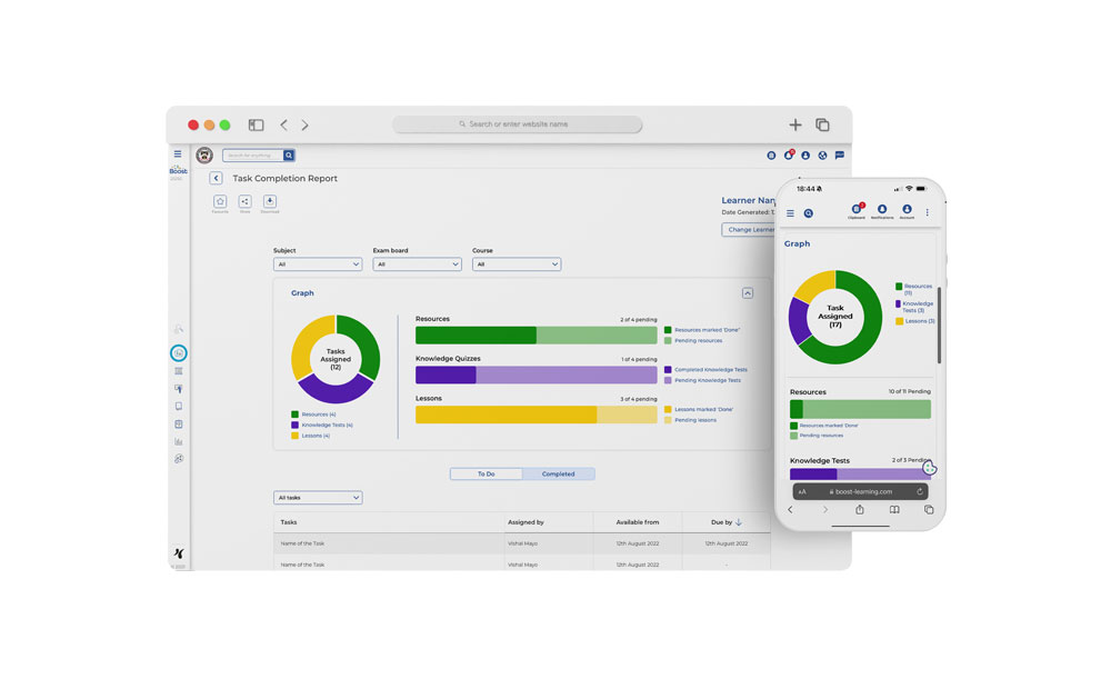
Another report was one to allow teachers to view what resources they have allocated to their students and to track their completion. The report needed to provide a breakdown of all the resources, knowledge tests and lessons that the teacher could share along with the ability to filter and narrow down these by choosing subjects, exam boards and courses that they could have shared.
For the layout of the report I decided to provide an overall visual comparison and a more detailed breakdown for the user. The visual comparison allows users to view a breakdown on the resources via a pie chart and bar chart to give an initial comparison and overall perspective that the user can see at a quick glance if they wish to quickly browse for a number of different students. For a more detailed breakdown, users are able to scroll further down to see further information on the exact task(s) that have been shared and when the task was assigned, when it was available and when it was due for the learner.
I opted to also include tabs to allow the user to filter between “to-do” and “completed”. This would allow users to easily filter between but also reduce the amount of information that would be visible and required to load which could strain loading speed on the platform. To allow users to further filter by subject, course and exam board, the user would expect to be able to see the relevant information across the report and therefore these controls would be required at the top of the report in order to allow all the content including the two visual reports to change to display information relevant to the users choices.
Boost was an existing platform which required certain improvement to help for existing customers and new primary customers with the launch of Boost Insights. The improvements have helped increase customer satisfaction and allowed for future-proofing potential new features within the platform. As a designer I was able to create subtle improvements that helped reduce time how much time a user required spending on the platform and as well as providing more valuable information with updated designs for the reports. The hope for the future of this platform is to continuously evolve and create an ever-building platform that will provide educational content and learning resources for teachers and students to use in the classroom and at home.
