The challenge
Boost Learning is a digital online learning platform created by Hodder Education. The platform was designed to allow teachers to engage with online digital content that they could assign to their students and use within lessons to help provide a more engaging online experience with their learning resources. Boost was initially created to have a secondary pupil interface (for students aged 11-18) with the content available on the platform only targeted for pupils in secondary school. Hodder previously had an existing platform called Dynamic Learning to supply their content to primary school teachers and pupils, however, with the look to combine all learning content under the Boost platform, a new primary interface would be required to provide a more user-friendly experience for younger pupils who might struggle to use the secondary interface.
The user
The primary interface is targeted to be used by children between the ages of 4 and 11. The platform needed to be easily to navigate and use since quite young children will need to use the platform who are still learning to read. We therefore needed to ensure the design was engaging and simplistic so children are not overwhelmed by the amount of information they see on one screen.
The outcome
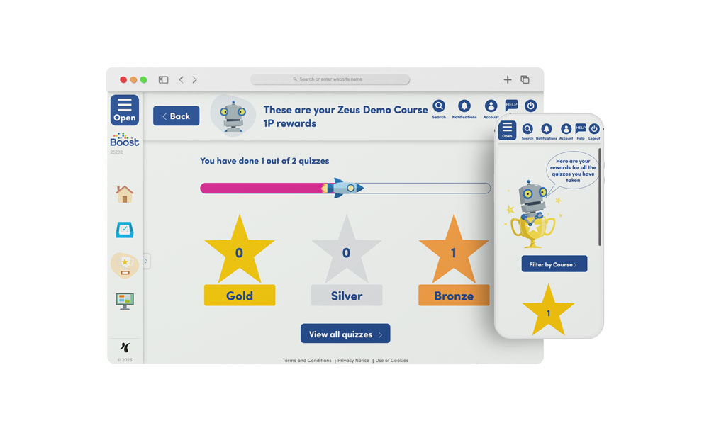
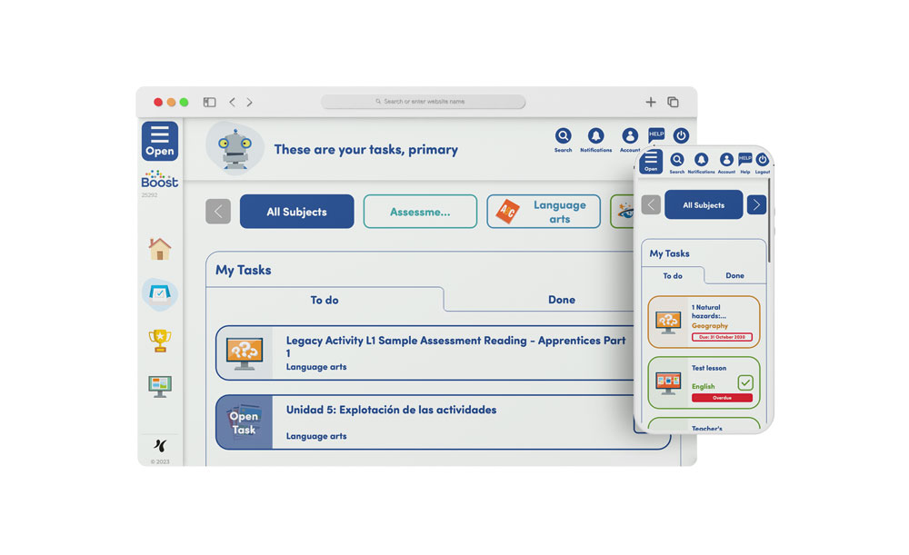
The general look and feel of the primary interface follows a similar structure to Boost Learnings secondary pupil interface. Students first arrive with the ability to choose what action they wish to complete such as viewing their tasks which have been assigned, their results of previous tasks completed and ebooks that have been shared with them. The platform has been designed with a more brighter and child-friendly feel with the use of large text and buttons to provide an easier way to read text/instructions as well as providing more surface area on the screen to select certain buttons. I also included the introduction of avatars into the interface to provide a more tailored and engaging experience within the platform. Users are able to choose what avatar they want with a wide variety of different characters including, animals and robots to choose from. These avatars will be seen across the platform as users navigate around and provide a more engaging way to explain key information about where the users at and whats going on on the screen they have arrived at.
One of the main uses of the platform for students is to complete tasks assigned by their teachers. Students are able to navigate to their “My Tasks” area where they can see a list of tasks that have been assigned. The structure of this page allows the user to filter by particular subjects which will only display if they have been assigned a task within that subject. Also due to the users been young, I limited the number of tasks shown on each page to 8 so that there wasn’t a long list of tasks which could become overwhelming if a student has a long list of tasks to scroll through. Instead we broke this up by allowing students to click through different pages to see all of their tasks.
Due to the user being between 4-11 providing results in an engaging and meaningful way was important to encourage and grow their engagement in learning. I decided to add a small element of gamification into the platform where scores were broken down into being represented by stars. These stars are available in the colours bronze, silver and gold which are used to represent how well a student has done on a particular task. The use of stars is to help encourage students to want to try and get as many as possible which can only be achieved by completing their tasks. I also included a task tracker so students can see how many tasks they have completed within each subject/course with the use of their selected avatar flying in a rocket towards the finishing line. This is to help encourage students to try and complete all of the tasks assigned to them so that they can see their avatar complete the tasks. These little elements of gamification should help students engage with completing their work in order to get a reward.
