Outdoor Entertainment Jersey
Outdoor Entertainment Jersey
Outdoor Entertainment Jersey are a premium events company who specialise in outdoor event equipment based in Jersey. The company started during the pandemic setting up cinema screens in peoples back garden. The company asked for a website when they first launched and since then the company and website has been evolving to what it is today not supplying other equipment such as soft play to also now having a booking system on the website for there inflatable football pitch.
Designer(s): Vishal Mayo
Developer(s): Vishal Mayo
Platform Built On: WordPress
The challenge
Outdoor Entertainment Jersey are a brand new company situated in Jersey the largest Channel Island. The company were looking to create a website to showcase their outdoor and indoor entertainment hire services which worked alongside their branding and would help users understand more about their business and provide an online platform to help reach a wider audience around the island.
The user
Outdoor Entertainment primarily wanted to focus on targeting adults especially parents to help for a range of different events including:
With the company being suitable for a range of different occasions Outdoor Entertainment needed to showcase a range of different packages and equipment hires that they could offer to help enhance their customers events.
The outcome
By using imagery throughout the site, this helped to communicate the range of services that Outdoor Entertainment offers to their customers. Having good imagery allows customers to visually see what type of service they can expect to help gain more trust for the user to want to use the company. Furthermore, the inclusion of existing reviews from Google and Facebook, help showcase how well the company have been for existing clients. This helps build trust for potential new clients and will help the business stand out from competitors.
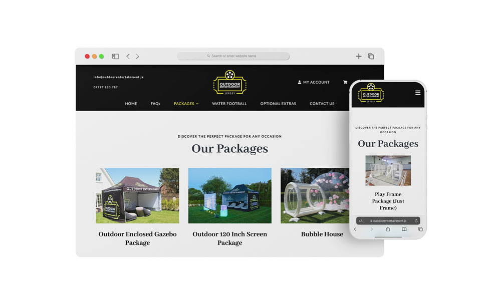
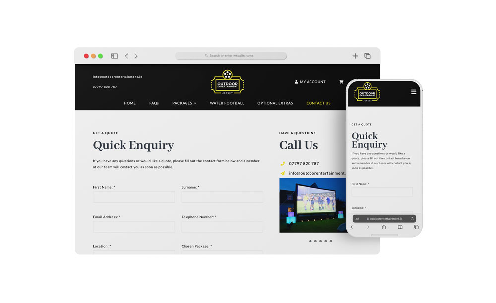
To keep in style with the companies branding I used black and white as primary colours across the site and their yellow accents for being able to highlights and act as a core colour for buttons and links. This helped to create a simplistic and clean layout in-keeping with the branding to help with creating clear brand recognition for the company.
