WorkProduct/UX2024–26

Hachette Learning
The pupil side of Boost for secondary learners, a self-directed home for homework, revision and reading that leads with what's due and keeps learners in the loop without nagging.
- Product Design
- Motivation Design
- Data UX
- Accessibility
- EdTech
Overview
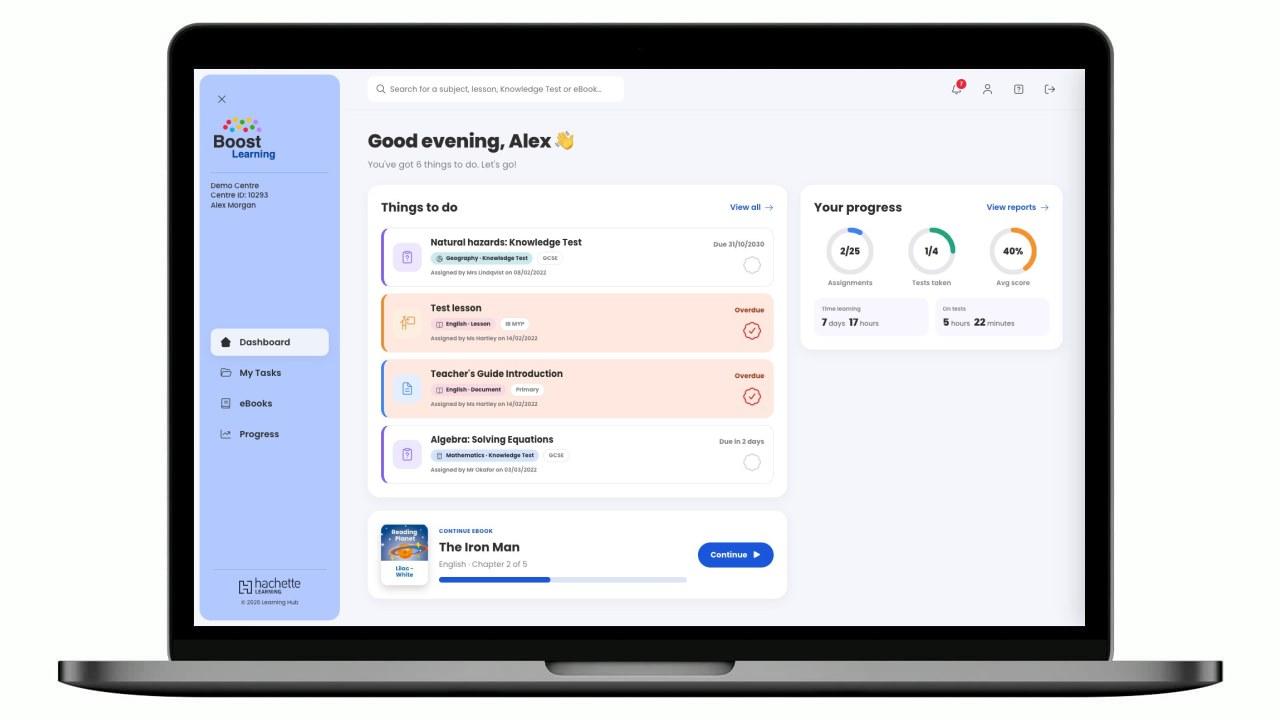
Boost Learning Secondary is the pupil-facing side of Boost, a white-label 'Learning Hub' for teenage learners working from Key Stage 3 up to GCSE, IGCSE, IB MYP and Scottish National 4 & 5, who manage their own time across many subjects and exam boards. Where the Primary pupil view strips everything back to one action, Secondary trusts learners with more, but earns that trust with clarity. I designed a dashboard that answers 'what's due?' straight away, gives every subject its own colour, makes progress feel personal, and keeps learners in the loop with friendly notifications for new work, marked tests and due dates, all built on Boost's shared foundations and prototyped in Angular, matured for an older audience.
Role
Senior Digital Product Designer, research, journeys, UI
Timeline
2024, 2026 (ongoing)
Team
Cross-functional squad: product, engineering, editorial
Tools
Figma, FigJam, Angular (signals) prototype, Usability testing, Accessibility testing
The brief
Give teenagers a self-service learning platform they'll actually keep coming back to: surface priorities without nagging, and keep learners on top of things rather than in deadline panic.
Learners juggle many subjects and deadlines, so priorities were easy to miss.
Progress was shown as raw numbers that didn't feel personal or motivating.
Learners only found out about new work, marks or feedback when they went looking, so things slipped past them.
The experience had to grow from Boost's foundations without feeling childish.
Research
I spoke with secondary teachers and looked at how teenagers engage with self-directed tools: they respond to clear priorities, a sense of ownership over their progress, and hearing about things that matter at the right moment. They disengage fast from anything that feels like a telling-off or a spreadsheet.
Lead with what's due
Teenagers want the platform to tell them where to focus. A 'things to do' list that leads with overdue and due-soon items became the spine of the dashboard.
Make progress feel owned
Progress rings, time-learning and average score framed as 'yours' turned abstract data into something a learner felt about, and wanted to move.
Nudge, don't nag
Teenagers wanted to hear about new work, marks and deadlines, but on their terms. Grouping notifications into Updates, Reminders and News, with a switch for each, kept them useful without feeling like a telling-off.
Journeys
The journey supports a self-managing learner: arrive, see priorities, act, and feel progress. Every step builds ownership and keeps them on top of things, rather than in deadline panic.
Persona: Secondary pupil (age 11–16), self-directed, juggling multiple subjects and deadlines
Structure
Organised around self-management: a priority-led home, direct routes to subjects and eBooks, and a progress area that leads into per-course reports, plus notifications and a personal account area on hand from the header.
Highlights
The screens a teenage learner lives in day to day, priorities first, every subject in its own colour, progress that feels like their own, and notifications that keep them in the loop.
System
The pupil side of Boost Learning, set in Poppins on a soft blue-grey canvas: a calm Boost-blue frame that lets each of twelve subjects carry its own canonical colour (with accessible ink pairings), section accents that mirror the teacher platform (emerald for eBooks, blue for work, purple for reports), progress shown as the learner's own, and a calm notification language, with one icon and tint per type and unread items lifted on a soft blue panel.
Colour
Page
#F4F6FB
Boost blue
#0D47A1
Action blue
#1A56DB
eBooks
#2E7D52
Reports
#5D4CCB
Ink
#2E2E2E
Overdue
#FFE8E0
Overdue ink
#A13D1F
Type scale
Greeting
Poppins · 34 / 40
Section
Poppins · 22 / 28
Body
Poppins · 14 / 22
Meta
Poppins · 12 / 16
Spacing rhythm
- xs4px
- sm8px
- md16px
- lg24px
- xl32px
- 2xl40px
Components
Impact
The dashboard answers 'what's due?' at a glance, progress feels owned rather than reported, and notifications bring learners back when something actually needs them, a pupil experience that sits naturally alongside the Primary view and the teacher platform as one Boost family.
The dashboard leads with overdue and due-soon work, so nothing gets buried.
Assignments, tests, score and time framed as the learner's own, not a report card.
Updates, Reminders and News, each one learners can switch on or off.
Reflection
Secondary was really about trust: give teenagers more control than the Primary view, but make the platform so clear they never feel lost with it. The fun part turned out to be notifications: working out what's worth interrupting a teenager for, and letting them switch off the rest. Sharing foundations across Boost, and prototyping it in Angular so it could slot into the real platform, meant the pupil and teacher products feel like one family rather than separate apps. Next, I'd test how often reminders actually help before they start to feel like noise.
Next case study
A family-run marquee hire company's website, rebuilt and rebranded to win trust for a high-stakes purchase and turn vague enquiries into fully specced, quotable requests.