WorkProduct/UX2024–26

Hachette Learning
The pupil side of Boost for younger learners, a warm, picture-first home where a child always knows what to do next and collects stars along the way.
- Product Design
- Child UX
- Accessibility
- User Journeys
- EdTech
Overview
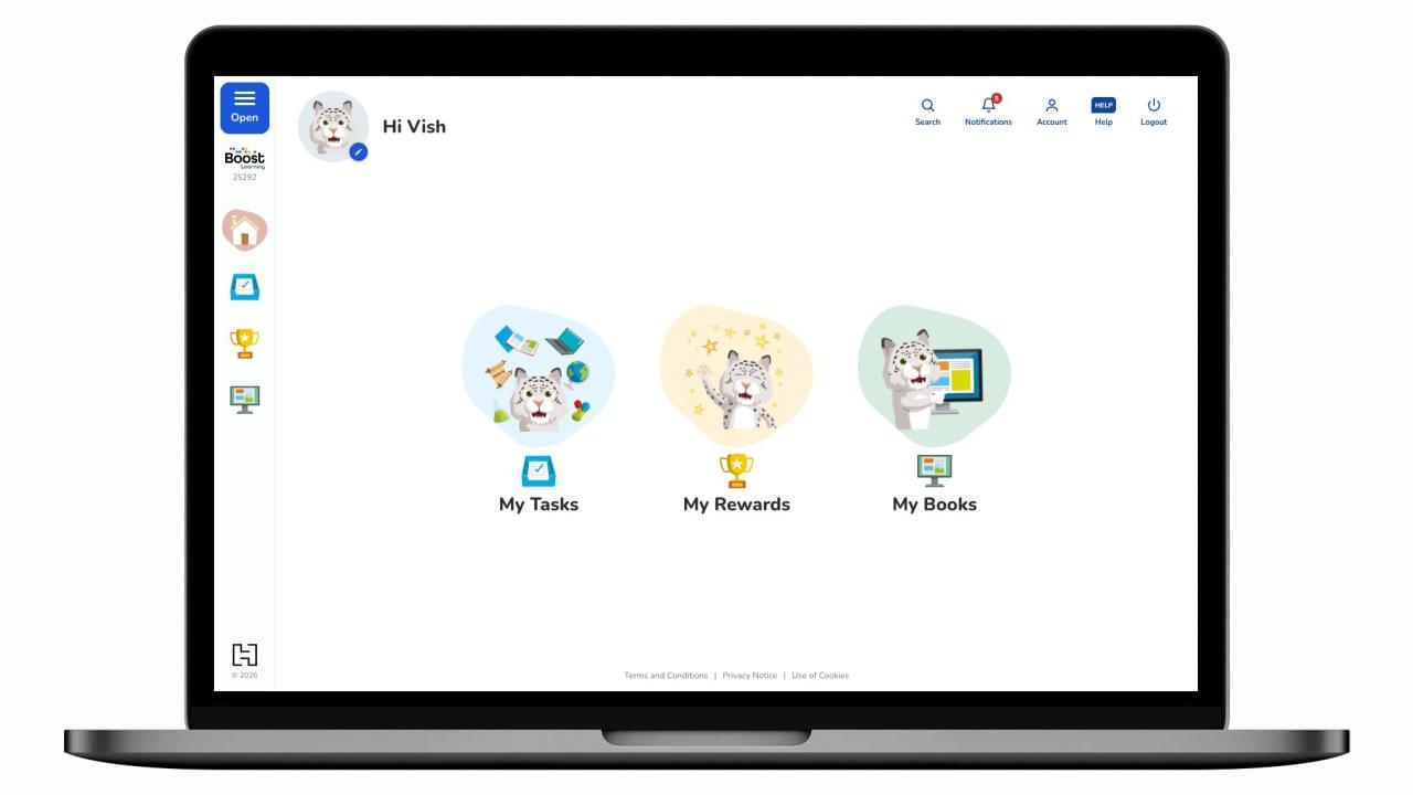
Boost Learning Primary is the pupil-facing side of Boost for children as young as five, often on shared school devices, sometimes with an adult and sometimes alone. That audience is unforgiving of complexity: a child who can't find the next step doesn't file feedback, they disengage. I designed an interface that leads with one obvious action, uses a friendly character and picture-first navigation, and meets accessibility and reading-age requirements as a floor, not a feature, on the same Boost foundations as Secondary, sharing its subject colours so a subject looks the same in both, and built as an installable app that keeps working offline, for pages they've already opened, on shared school devices.
Role
Senior Digital Product Designer, research, journeys, UI
Timeline
2024, 2026 (ongoing)
Team
Cross-functional squad: product, engineering, editorial
Tools
Figma, FigJam, Angular 21 prototype (installable PWA), Accessibility testing, Classroom research
The brief
Design a learning platform a young child can operate with minimal reading and minimal help, that still gives teachers the structure, tasks, books, rewards, the curriculum needs behind it.
Users may be pre- or early-readers, so text-heavy navigation excludes them.
Choice overwhelms young children; too many options reads as 'no clear next step'.
Shared devices mean no assumptions about a persistent, personal setup.
Accessibility, contrast, targets, reading age, is a hard requirement on every screen.
Research
I worked with teachers of early-years and KS1 classes and observed how young pupils behave with software: they tap the biggest, brightest thing; they rely on pictures and characters over words; and they need instant, encouraging feedback or they lose confidence. Accessibility audits set firm limits on colour, type and touch-target size.
Pictures are the interface
Young children navigate by image and character, not label. A friendly avatar and illustrated destinations did more for wayfinding than any menu wording.
One clear action beats a dashboard
Fewer, bigger choices reduced hesitation. Three illustrated destinations, Tasks, Rewards and Books, gave a confident 'what do I do?' answer.
Encouragement drives engagement
Immediate praise from the character and a visible stars loop kept children returning; abstract scores meant nothing to them.
Journeys
The whole journey is designed to be walkable by a child who reads little and asks no one. Every step leads with a picture, a character and a single obvious action.
Persona: Primary pupil (age 5–8), early reader, often on a shared classroom device
Structure
Deliberately flat and picture-led. Three destinations, each a world a child can hold in their head, no nested menus, no jargon.
Highlights
The whole platform, sized for a young child, a friendly character, big illustrated destinations, and one obvious action on every screen.
System
A warm, high-contrast, playful system on the same Boost foundations as Secondary, but expressed for young children: a soft rounded typeface (sofia-pro-soft, with Nunito as the web fallback), big touch targets with chunky 3px subject borders, a friendly character on soft colour blobs, the same eight subject colours as Secondary, and generously legible type, all within WCAG limits.
Colour
Boost blue
#1A56DB
Blue deep
#0D47A1
Blue pale
#EDF2FB
Ink
#2E2E2E
Ink soft
#565D64
Home nav highlight
#E2B7AC
Tasks blob
#AADDF9
Rewards blob
#FED478
Books blob
#76C09A
Type scale
Hero
Nunito · 30 / 36
Section
Nunito · 26 / 32
Card title
Nunito · 24 / 30
Body
Nunito · 17 / 24
Spacing rhythm
- xs4px
- sm8px
- md16px
- lg24px
- xl40px
- 2xl64px
Components
 English
 Mathematics
 Science
 History
 Geography
 Computing
 PE
 Reading
Impact
Young pupils can navigate the platform largely unaided: the picture-first, one-action model held up in testing with early readers, the character keeps them encouraged, and the stars loop gives a reason to come back. It reads as the little sibling of the Secondary view, the same Boost family, sized right for five-year-olds.
The whole platform, child-sized: Tasks, Rewards and Books.
Animals, boys and girls, including glasses and hearing-aid versions, so every child can find themselves.
Contrast, touch targets and reading age held throughout.
Reflection
Designing for five-year-olds is the most honest usability test there is: they can't be won over by clever copy or a nice gradient, if it isn't obvious, they leave. Almost everything I stripped away made it better, and the discipline of 'one clear action' has quietly improved how I design for adults too. Next, I'd add audio prompts so pre-readers lean on text even less.
Next case study
The pupil side of Boost for secondary learners, a self-directed home for homework, revision and reading that leads with what's due and keeps learners in the loop without nagging.