WorkProduct/UX2024–26

Hachette Learning
Laying the foundations for Hachette Learning's teaching platform: better sharing, clearer subscriptions, richer lesson planning and a stronger front-of-class reading experience.
- Product Design
- Data UX
- User Journeys
- Design System
- EdTech
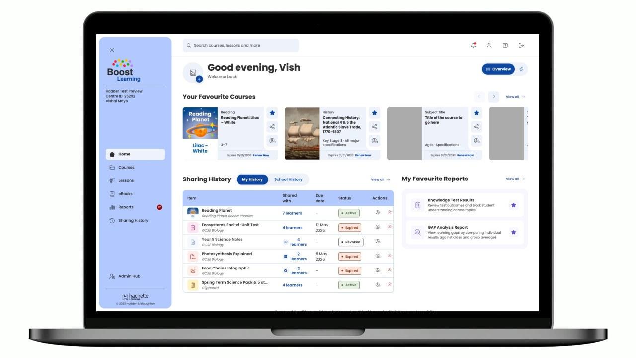
Overview
Boost Learning was built during COVID to get every Hachette Learning product and eBook into one digital place for teachers and learners. It became the home for all of it, but it never got much love or investment afterwards, and slowly fell behind its competitors. This project was the first real push to change that: foundational improvements led by customer feedback, focused on retention and on preparing the ground for a near-future chapter of AI-powered features. I worked across the areas teachers raised most, the sharing and assigning flow, subscription and sharing history, the Reading Planet front-of-class experience, and lesson and course planning.
Role
Senior UI/UX Designer, research, journeys, UI, prototype
Timeline
2024, 2026 (ongoing)
Team
Cross-functional squad, product, engineering, editorial
Tools
Figma, FigJam, Angular prototype, Usability testing, AI-assisted prototyping
The brief
Built fast during COVID to get every product and eBook online, the platform had since been left largely untouched while competitors moved on. The direction came straight from customers: recurring Zendesk tickets and support issues, plus research workshops with customers to gather all the pain points in one place. That gave us a clear set of foundations to prioritise, aimed at retention and at setting the platform up for what comes next.
Sharing was clunky: the modal for assigning work to classes needed to be quicker and clearer.
Teachers couldn't easily understand what the existing sharing history area meant, and struggled to know how many licences they had and could share.
Reading Planet, the primary reading scheme, needed a stronger front-of-class experience, one fitting for that customer type rather than being forced into the existing platform experience.
Lesson and course planning was rigid, hard to structure and not customisable enough for how teachers really plan.
Research
Working alongside the product teams, we created questionnaires, visited schools in person and spoke to teachers on Teams calls to understand their day and where the platform slowed them down. Alongside recurring Zendesk tickets and support issues, the same themes came back: reporting was valued but hard to understand and slow to load, sharing and subscription information was confusing, and teachers wanted the whole thing to be easier, faster and more customisable to how they work.
Reporting was the friction, not the feature
Teachers valued reporting but avoided it because it was hard to understand and slow to load. Making that data clear and quick to reach mattered more than adding to it.
Sharing and licences were opaque
The share flow and sharing history were hard to interpret, and teachers couldn't tell how many licences they had or could still assign. They needed the information legible at a glance.
Save time, and give control
Above all, teachers wanted the platform to be easier and faster, taking time out of their day rather than adding to it. And no two teachers wanted the same things, so it needed to be more customisable to fit how each of them teaches.
Journeys
Rather than one flow, the work spanned the teacher's whole loop: planning, teaching, assigning and checking in. I mapped that end-to-end to find where the platform was adding time instead of saving it, and designed each step to be quicker, clearer and more in the teacher's control.
Persona: A time-poor teacher planning lessons, teaching front of class and assigning work to their classes across a busy week
Walkthrough
The areas we improved, step by step, from a teacher building their own homepage to teaching a lesson at the front of class.
Building your own dashboard
No two teachers work the same way, so the homepage is theirs to shape.
Highlights
The parts of the platform teachers use every day, from a homepage they build themselves to planning, reporting and spotting who needs help.
System
The platform runs on Boost Learning's shared UI library, a set of bl-* components themed with Material 3 tokens. Every course section carries its own light / medium / dark colour trio, so Resources, eBooks, Course Plans, Lessons, Knowledge Tests and Reports each read as their own space while sharing one type scale (Poppins) and one component set.
Section colour schemes
Each course section is themed with a light / medium / dark trio.
Blue
Default Interface and Resources
#EDF2FB
#B2C9FF
#0D47A1
Green
eBooks
#D9EBE1
#79B895
#2E7D52
Pink
Course Plans
#F6CACC
#EC8385
#9C191B
Orange
Lessons
#FEF0E1
#E38741
#8F250C
Crimson
Knowledge Tests
#FFE5EC
#FFB3C6
#C9184A
Purple
Reports
#F8F7FF
#D8D8FF
#5D4CCB
Type scale
Page title
Poppins · 28 / 36
Section
Poppins · 22 / 28
Body
Poppins · 14 / 21
Meta
Poppins · 12 / 16
Components
bl-button
bl-badge
bl-tabs · underline
bl-tabs · pill
Cards
The content tiles used across the app — courses, folders, resources, eBooks, course plans and reports, each themed to its section.
User Guides
3 resources
Knowledge Test Results
Review test outcomes and track student understanding across topics
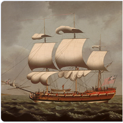
Connecting History: National 4 & 5 The Atlantic Slave Trade

Impact
This project was about bringing the platform up to scratch against competitors. By focusing on customer complaints and pain points, we delivered an improved platform that was ready to start taking on new features, and, in the meantime, one that helped retain existing customers (and win a few new ones) while those features were still being worked on.
A rebuilt share modal, sharing history and subscription view that makes viewing licences and history easier to track and monitor.
Reading Planet split into its own bright, visual eBook library of around 500 books, filterable by reading level, strand and genre for whiteboard teaching.
Course plans teachers can reshape, lessons they present front of class, and a homepage they build themselves.
Reflection
The big lesson here was that you don't always need a shiny new feature to make a difference. Fixing the everyday frustrations teachers had been raising for years, like sharing work, seeing their licences and teaching at the front of class, did more for how the platform felt than any single headline feature could. It also bought the team time and goodwill to build the new AI features on solid ground. Next, I'd keep treating support tickets as a design tool in their own right: they're the most honest backlog you'll ever get.
Next case study
The pupil side of Boost for younger learners, a warm, picture-first home where a child always knows what to do next and collects stars along the way.